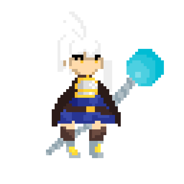
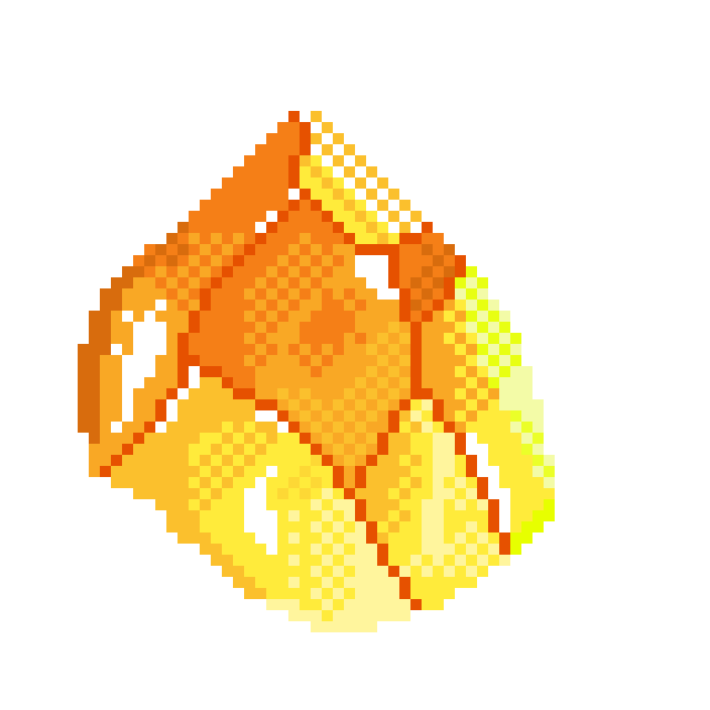
#18 The fights continue, we'll need an armor (thank God I had one in the basement)
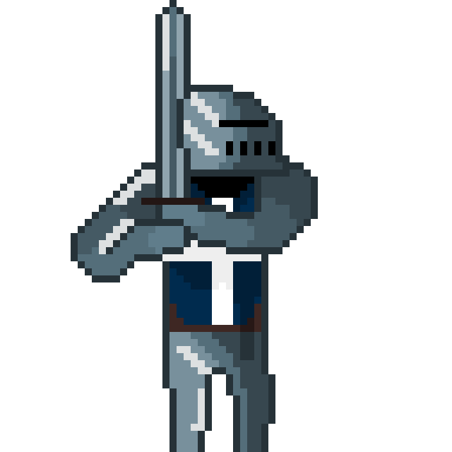
I know, wow Citrus, so many arts in such a short time. You are such a great writer who cares about your audience.
To be honest, I told my self that I will TRY to make two pixels a week instead of one. But it hit me, it's such a terrible way of thinking. This implies that every moment I can just stop or do not do commit to it even once, because it's only a try. Instead, I WILL do it! If I fail, fine! But I will do my best till the end!
It's lesson for today, do not try to do things, just do things! Failure is ok! You WILL do better!
I want to make better full body humans. It's so hard to find correct proportions and keep them. Now I kinda understand why artists need naked woman to pose for them... I have to find some too.
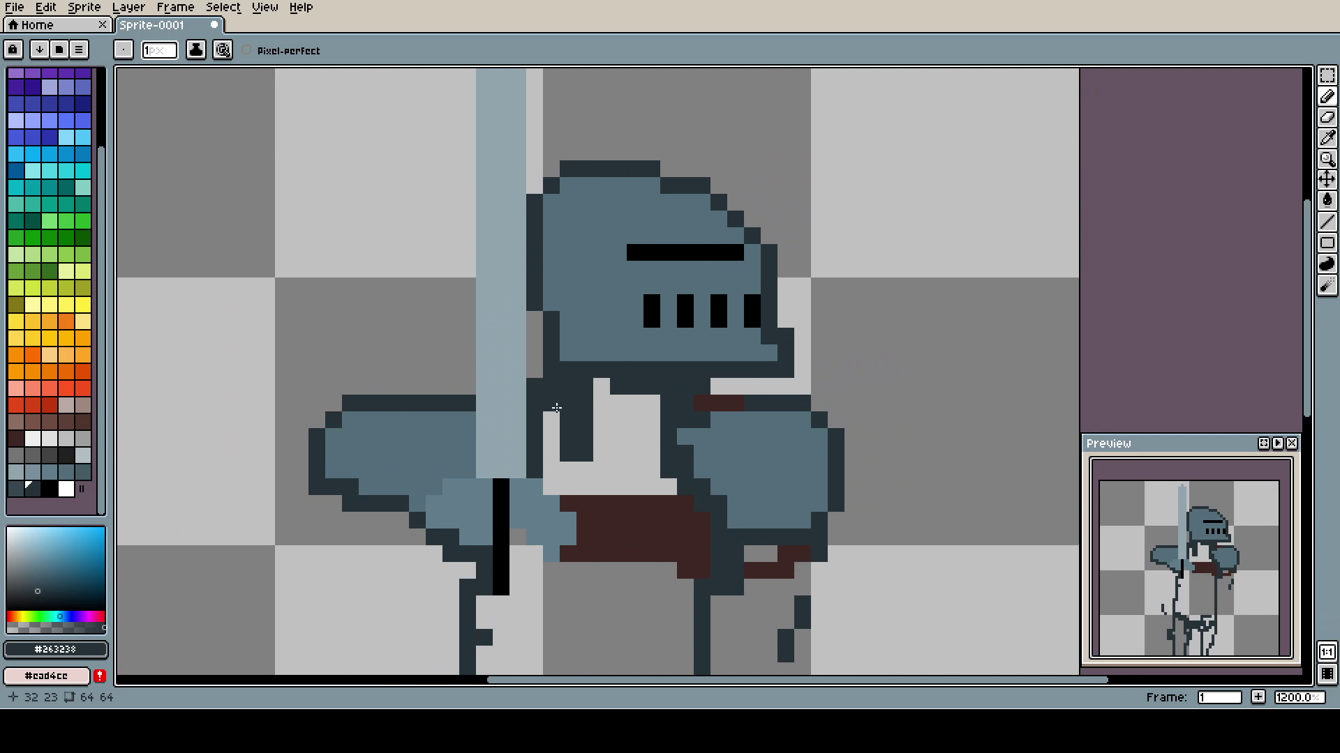
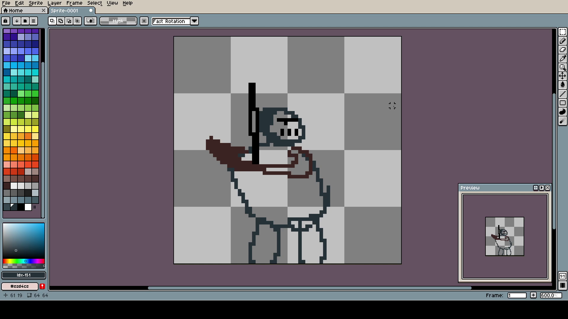
Because I had no idea how to set this guy up, I didn't follow my typical drawing procedure. Instead of the shape of the whole art, then filling and details, I made a few detailed fragments to have a reference point, for the proportions. I think it's the better way if you draw humans.
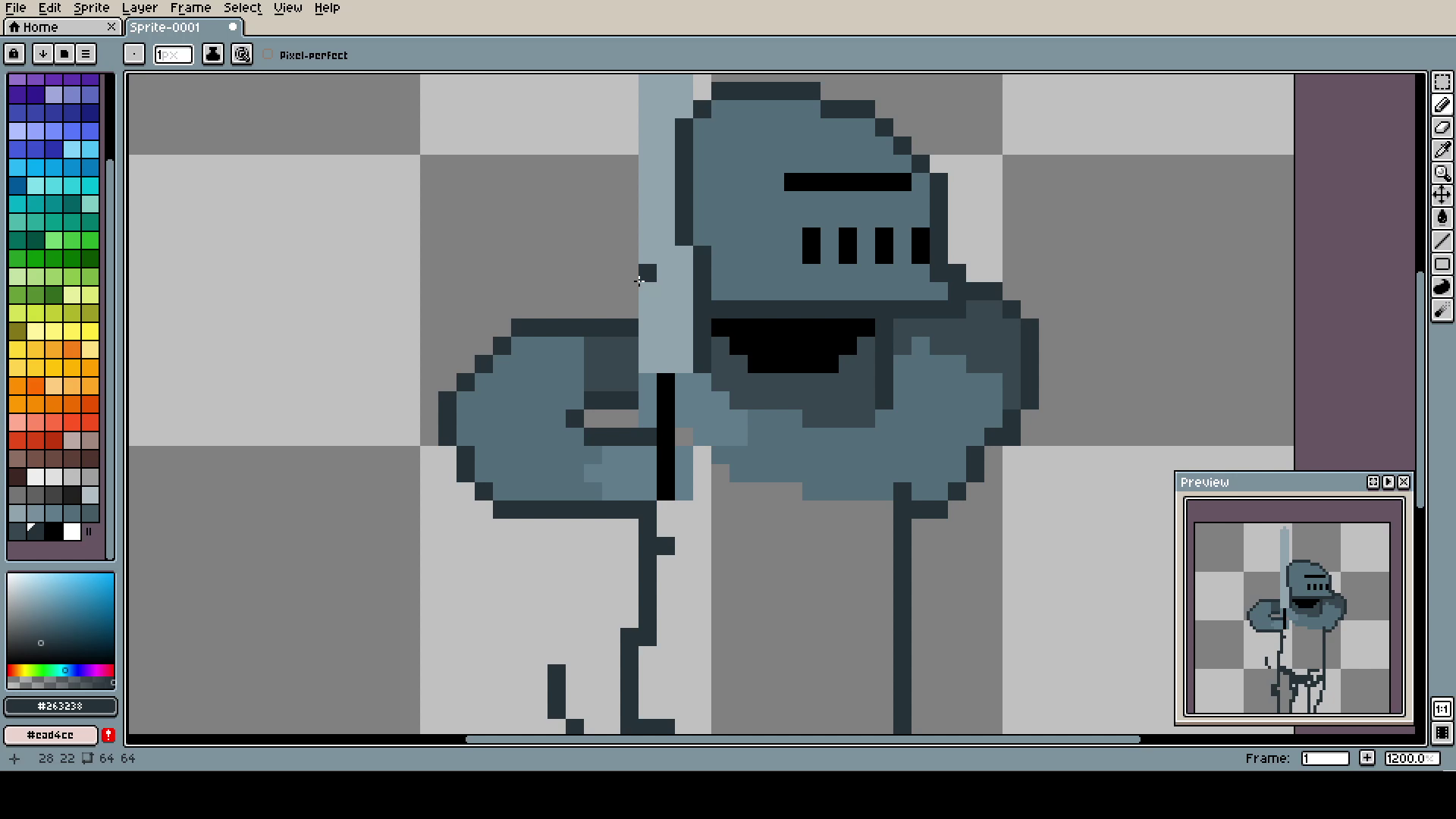
Left hand was sooooo difficult. I changed it like twenty times, I won't show all of it, but if I had to give some advice: place one end of the limb, place the opposite one, and try connecting them together till they will look more or less natural. Sorry, I was my method and I do not know any other.
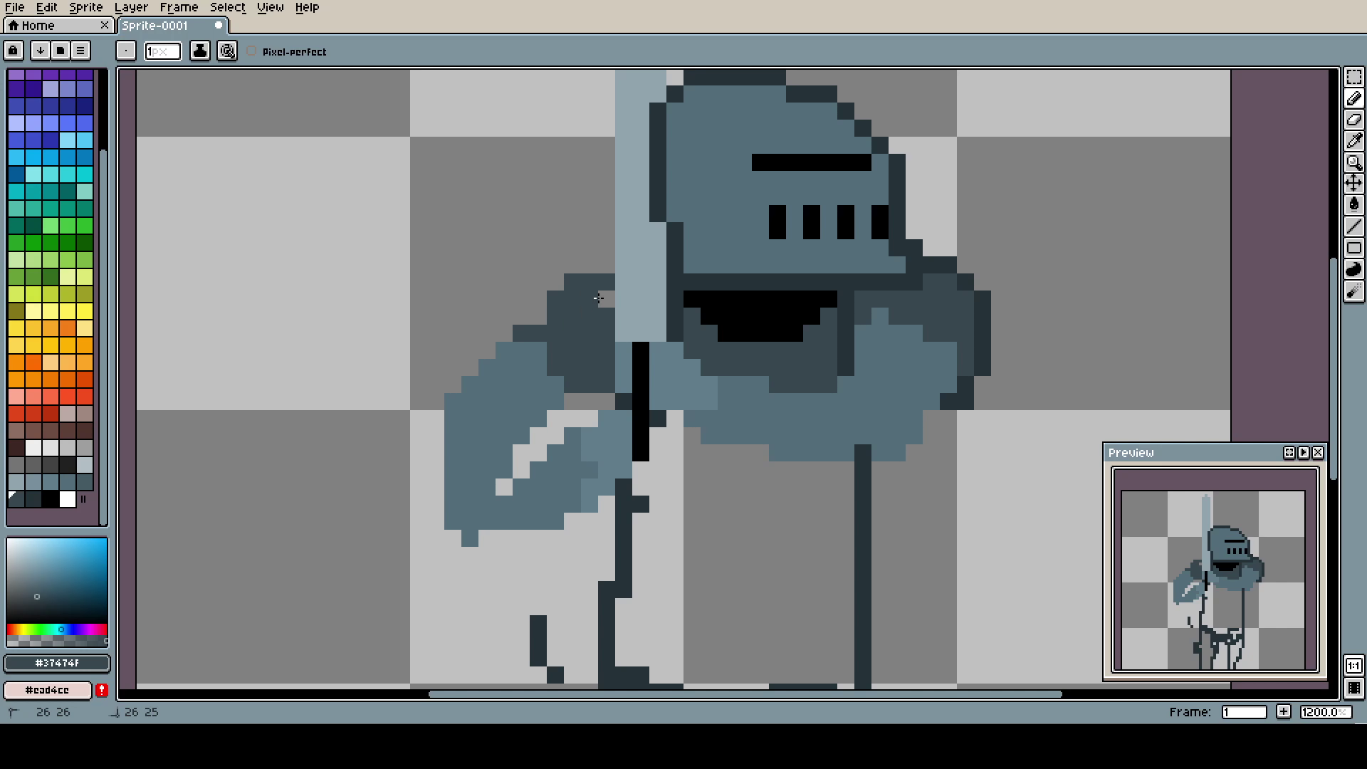
After the "connection" make sure to make the limb look kinda natural. This poor boy got his hand broken in half.
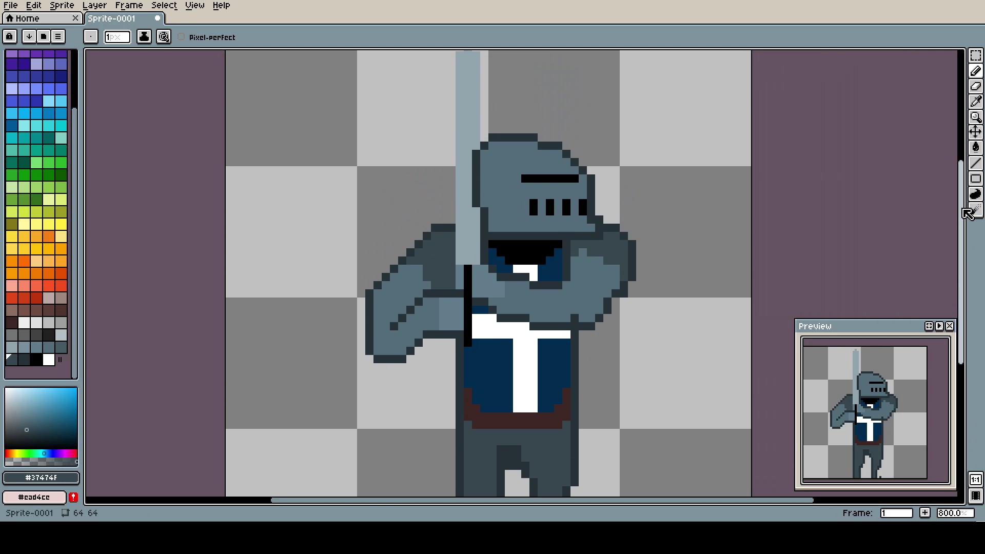
Now it looks better, but still not perfect. The wrist is weird for me. The chest is funny looking. At the start I wanted to make it plait armor, but hands were hard to read on their own with so many different shades of gray and lines, that I decided to just give him a flag to fight for. That way he can hope he is dying for something.
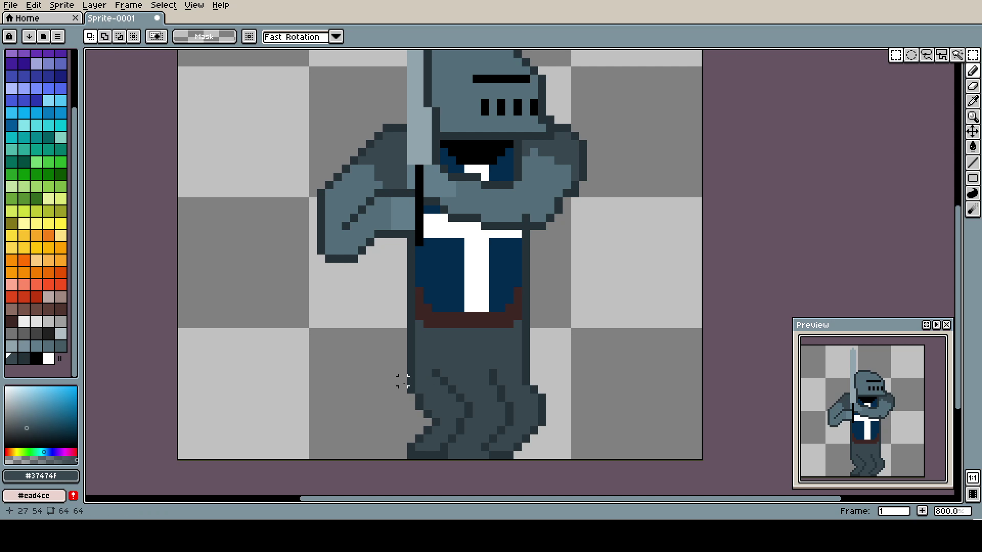
The legs are also problematic, but fortunately, much simpler than the hands. Just make anything that do not look like your character should be on a wheelchair (picture related) and it will be good enough.
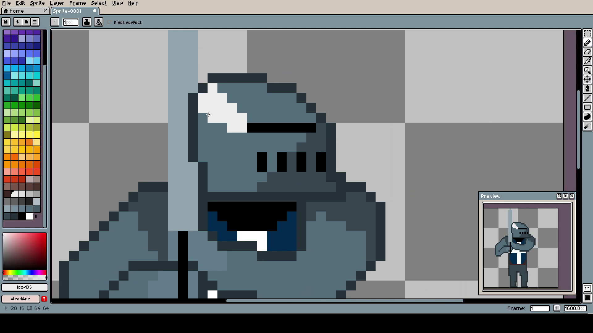
The light was irritating. I have no idea why, but the white was too bright? So I had to use really light gray instead. Funnily enough, in this background it looks almost as white. We have such a weir color perception.
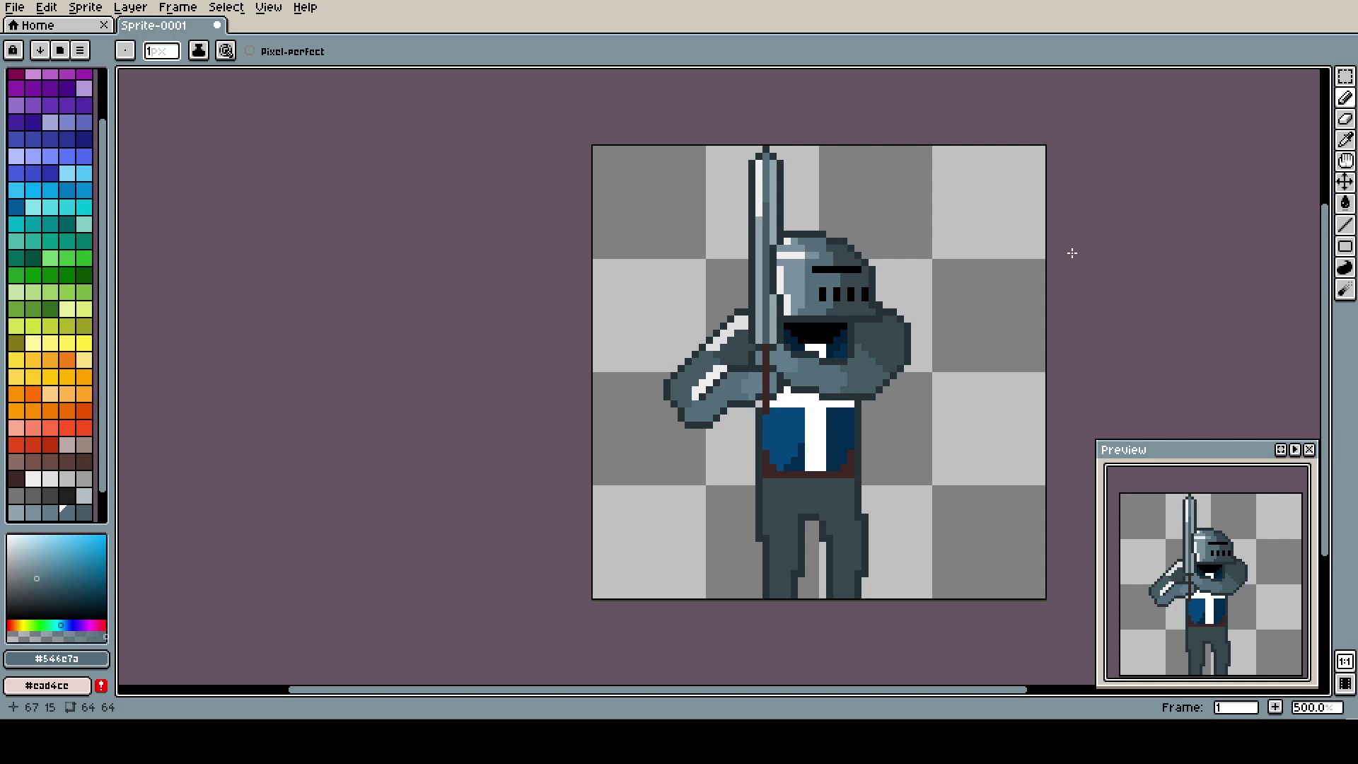
I made the hands multicolored so it will seem like they are different parts of the armor. That was my idea of impelling the plated part. Do not throw away our ideas, they might not end up as you imagined them, but they can make great addiction. Your contribution and interpretation is what makes whatever you create truthy unique!
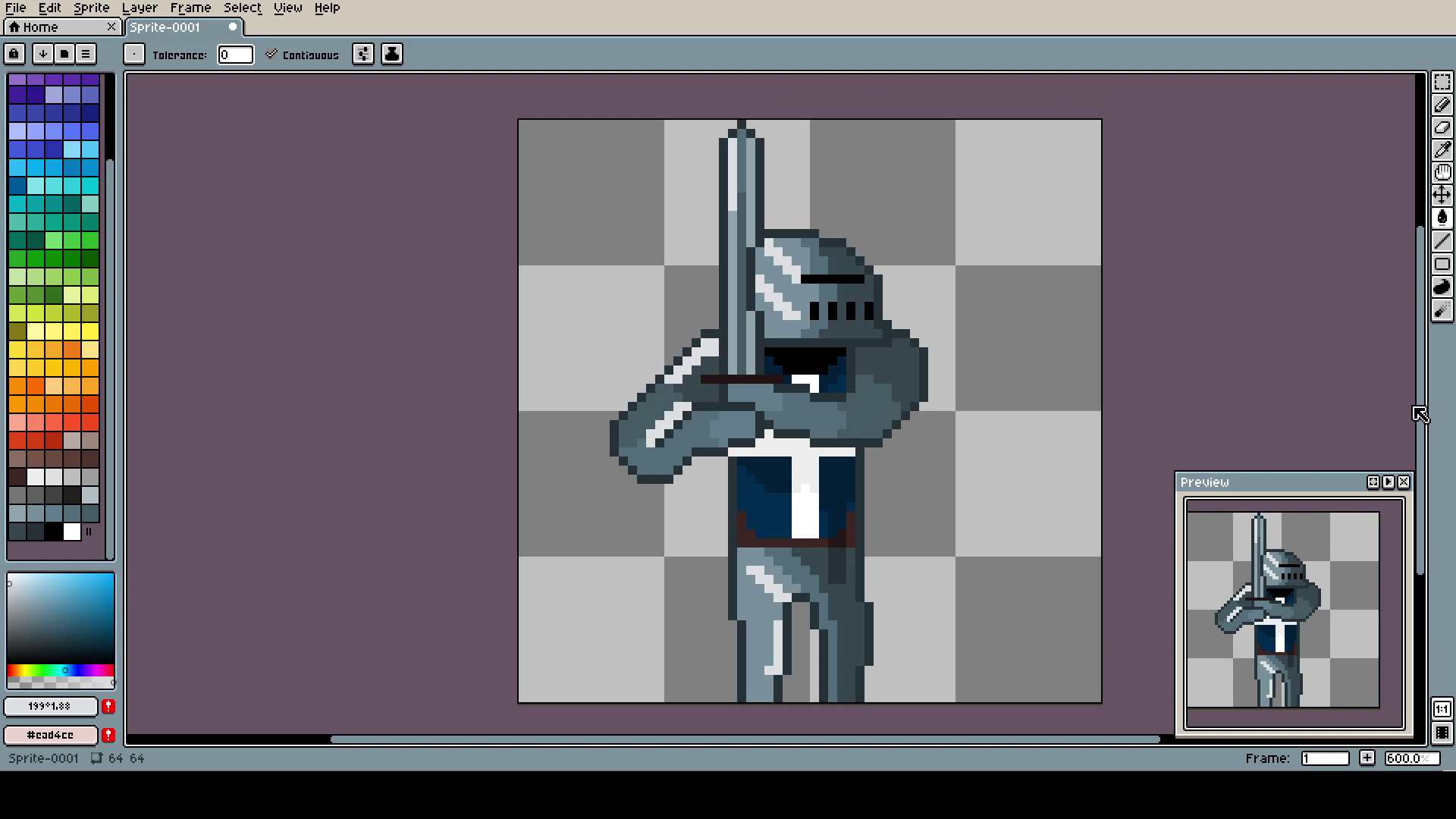
Some shading on the chest and light on the legs. They are the worst part, but to be honest, the arms took me such a long time that I didn't have energy for legs, lest. I said a million times I'm lazy, ok?
Anyway, thank you for reading! And remember, do not try things, DO things!
