#19 Not very impressed (he should be)
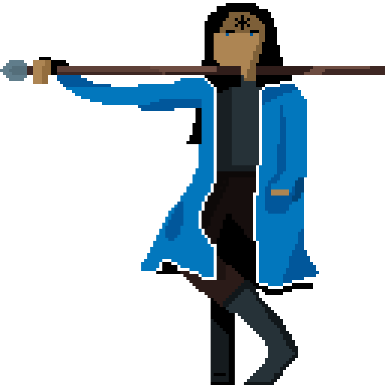
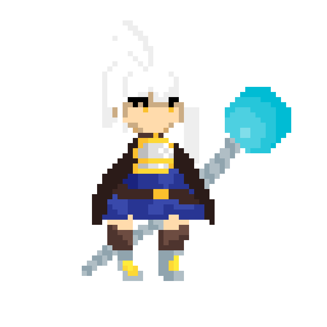
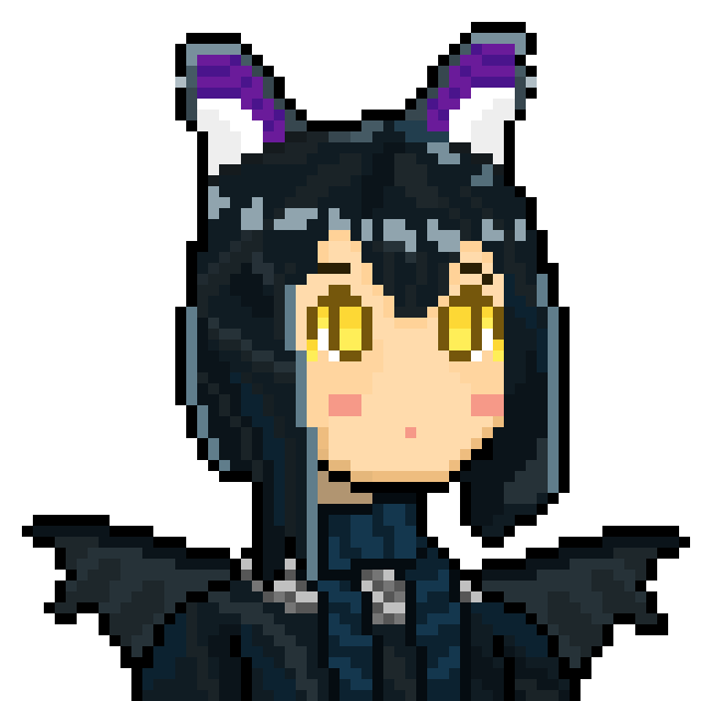
Heyooooo! I have only one thing to say today (I still need some more time to think about the next BIG topic). My art was used on stream. Someone really chose it to represent part of their content. One small act, but it means more than a milion words.
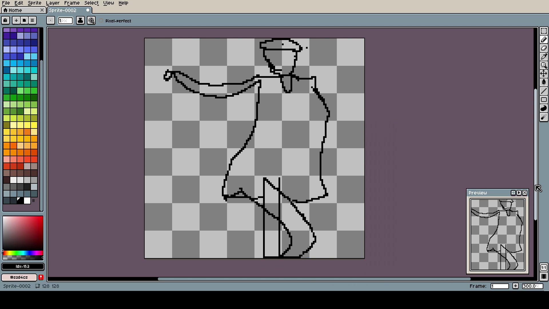
Still working on humans. This time I was using other art as a template for a pose. It's much easier, and lets you focus more on the composition. I think, till you can naturally draw human with correct proportions, it's the better way. Also, I do not know if I should draw like a body out of sticks to better see the pose or what. Maybe I will try it next time.
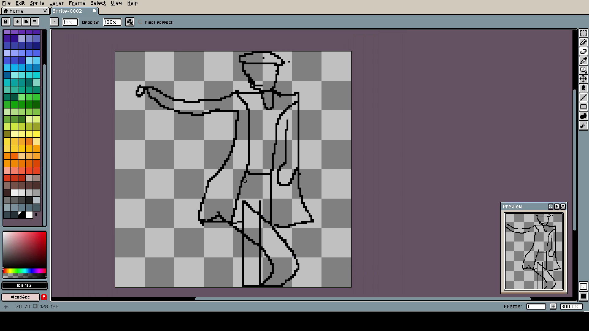
Little correction to the pose. He looks funny as hell.
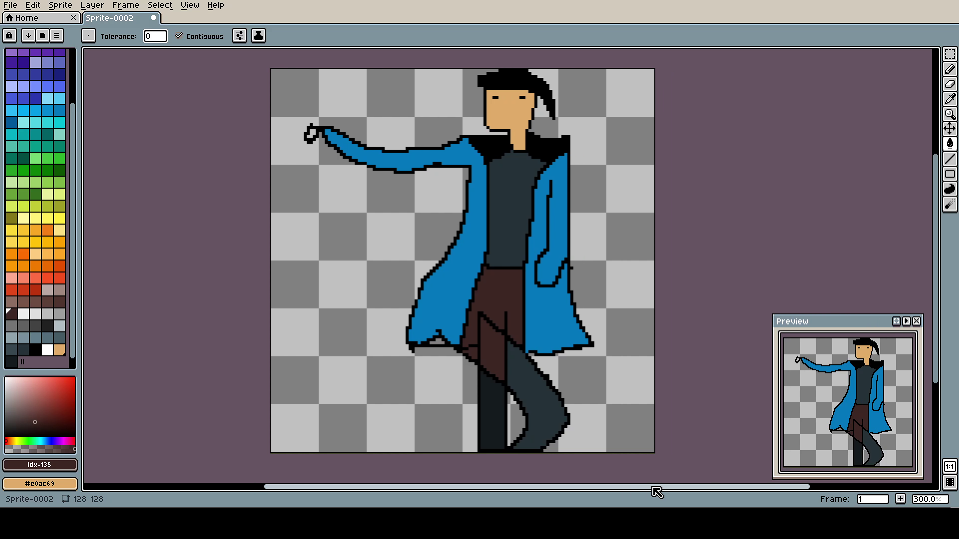
How it's even funnier with the colors. Also, I try to use less of them. I have a tendency to make 30 shades of everything and then the whole art looks like it's blurred.
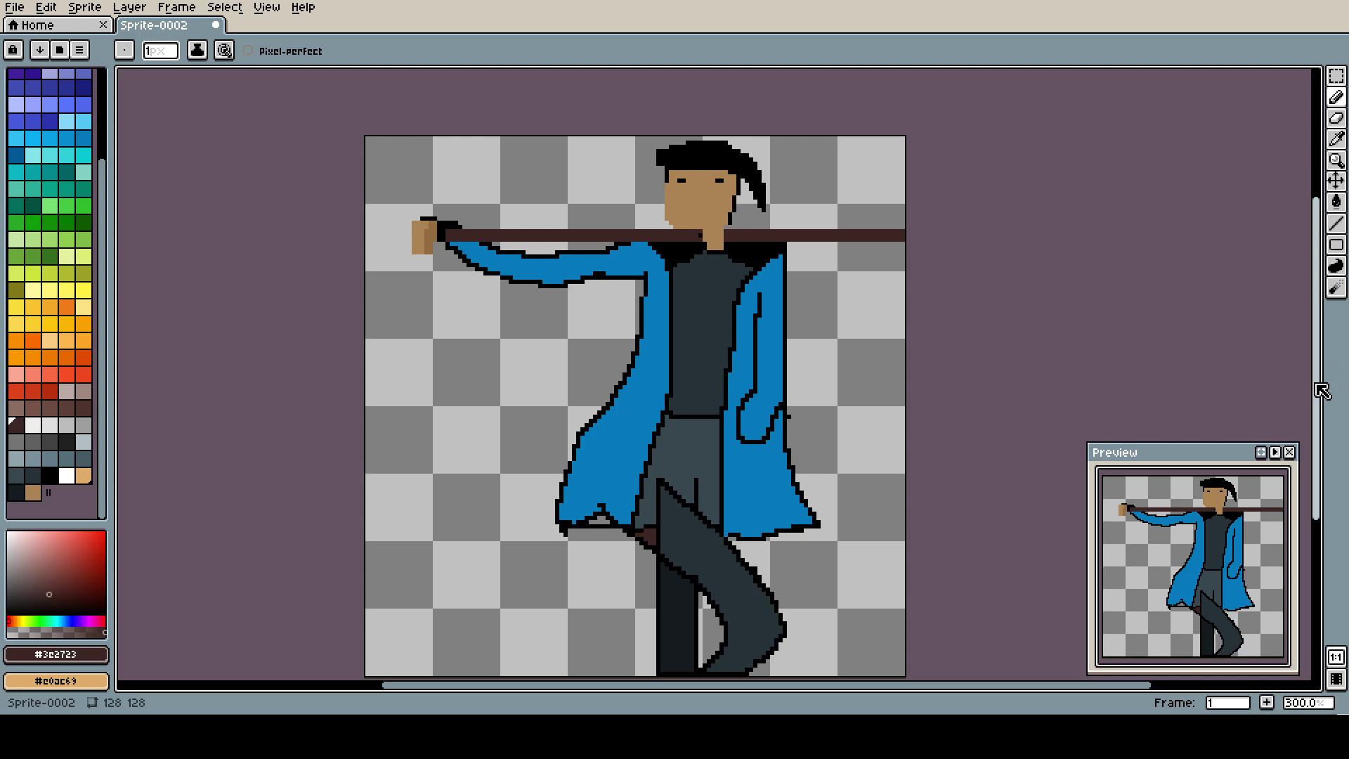
The hand looks so smooth. Only to colors, but well-placed, it can make all the difference.
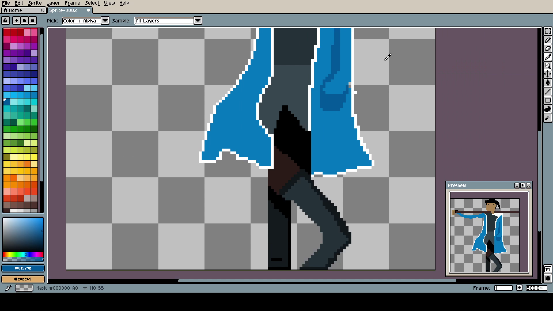
Time for a leg day (sorta)! Another change I try to implement it to not outline everything with black. Yea, I have a lot of things to work on, and I'm still terrible at basics. Anyway, right shading is everything. No need for any more details.
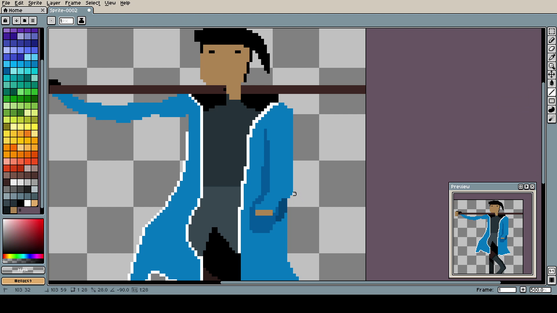
This hand in pocket design is so brilliant. I wonder if I will ever be able to create projects like this on my own.
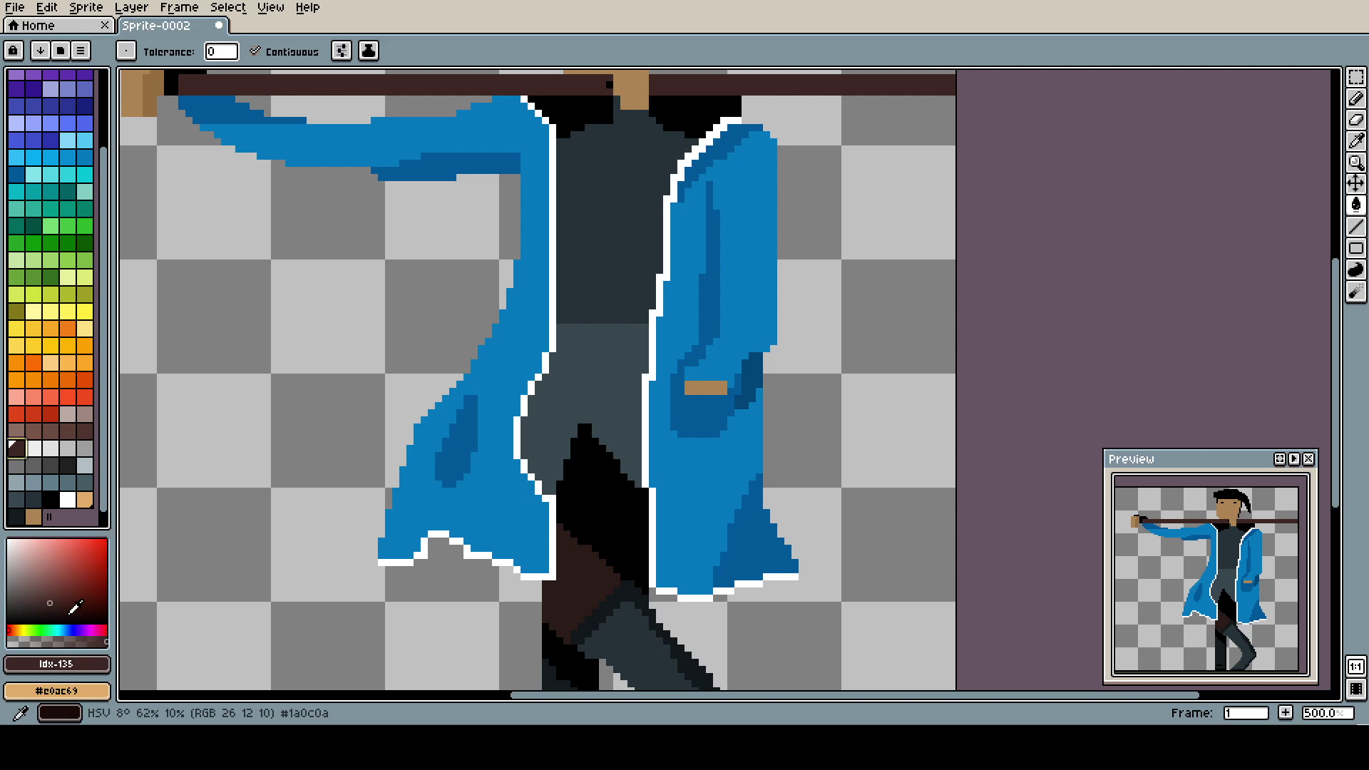
Little changes to the coat (the white outline was a mistake, ok?).
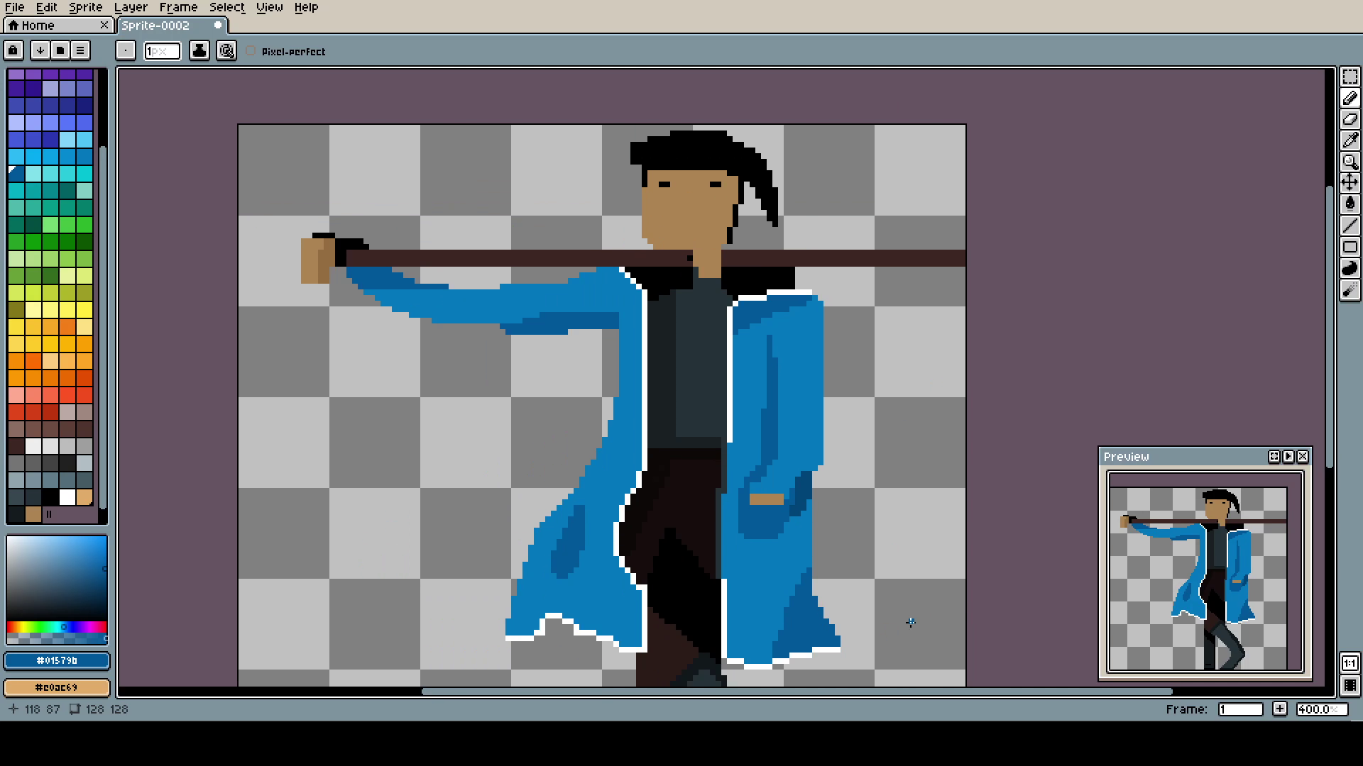
Nothing changed, but pants color and shading. It's honestly amazing.
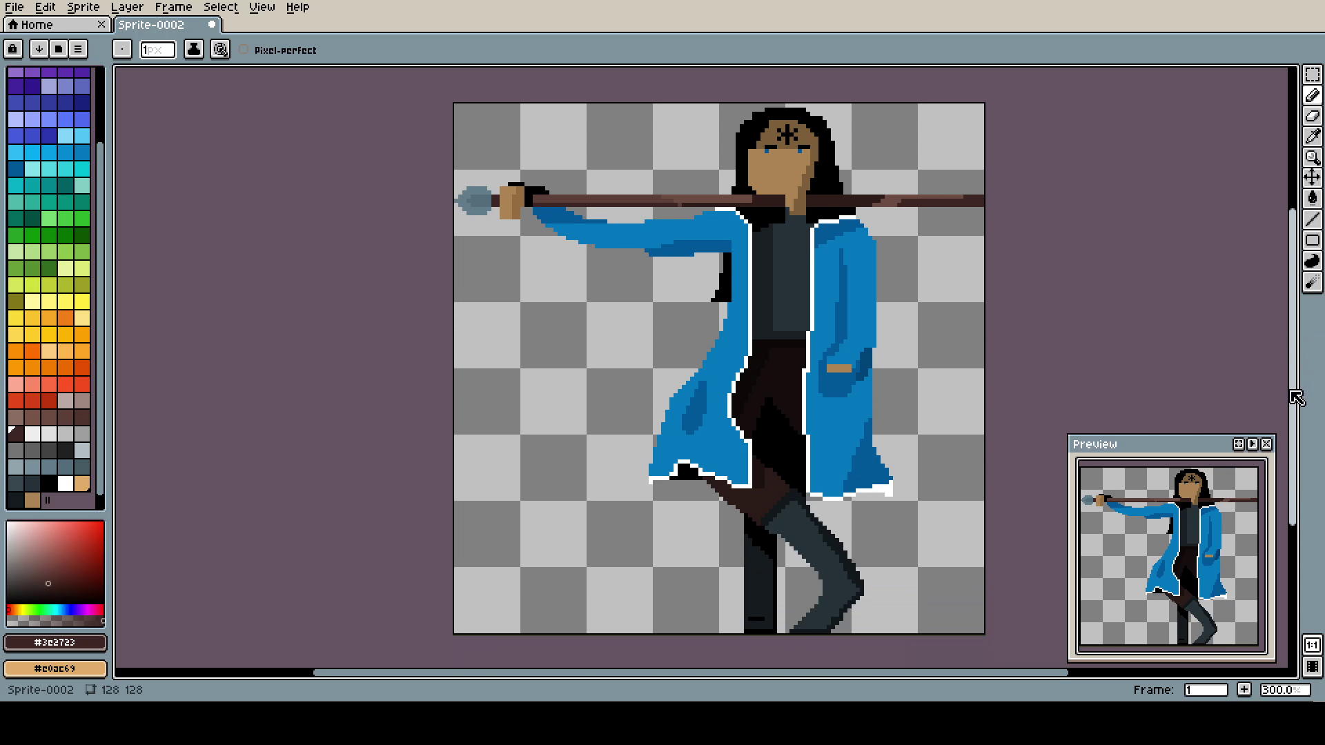
I wonder if any one of you will recognize the character. Honestly, it looks soooo great and it was easy to do.
Sorry for a little shorter post, but to be honest, I do not know what else to write. Just try following my steps and believe: it's easy. Two shades of every color, one main and one for shade. The least possible amount of details. Good luck! Remember, if I can do something, you can do anything!
