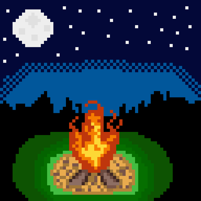
# 10 May be not the brightest, but warm and cosy campfire
Hi! I did not disappear this time. I count it as a progress and expect a praise... c'mon.
This week it was my first try to speed-draw. The set time was 30 mins so it's a little lest polished than my other works... you won't probably see a difference, it's as bad as all others.
Also, I think this is my first time drawing something with a background. I really liked it and you should also try. Started with just some lines and colors to have a reference point.
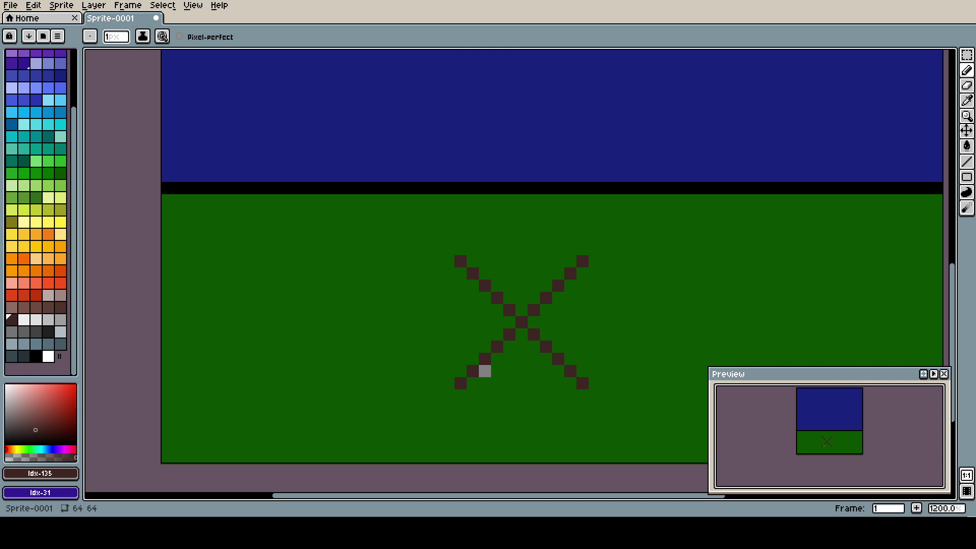
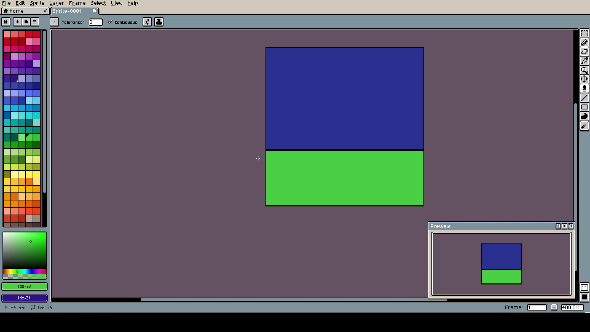
I have a giant problem with placing parts in correct places, that's why you will see a lot of placeholders like this. Lesson: If you work on some kind of landscape, place random shapes so you will be able to see the proportions and plan better.
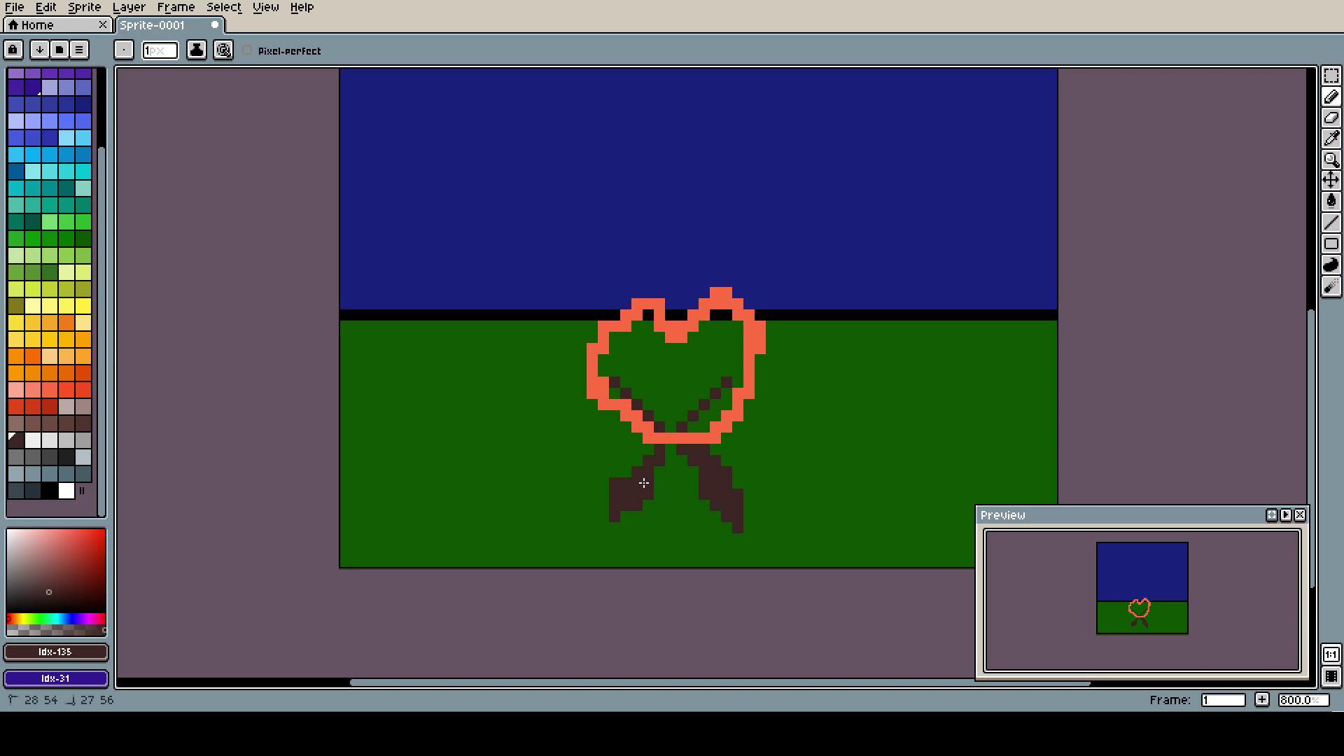
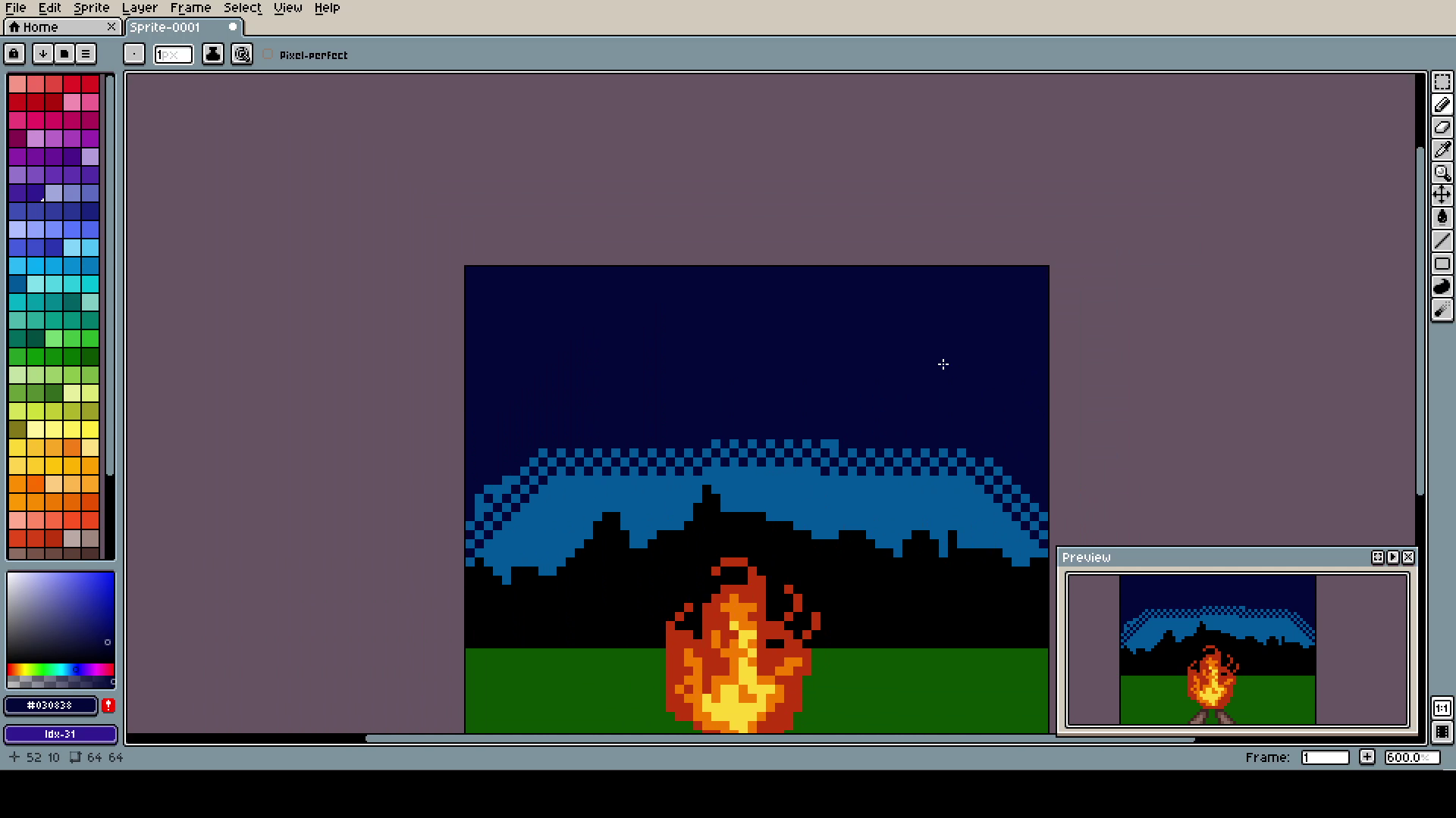
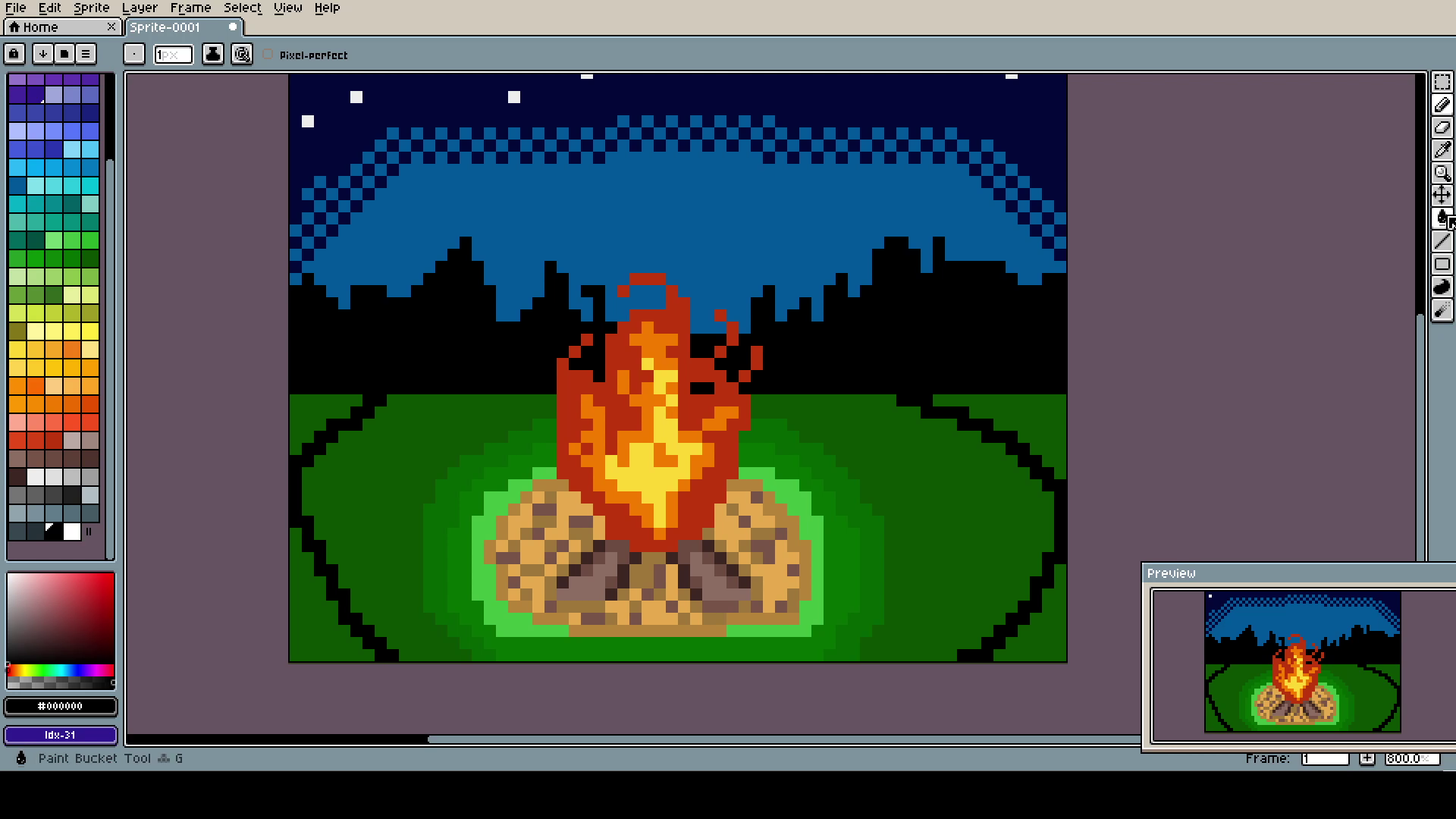
Wanted to make a campfire in the night. The suffed heart in the middle is actually the fire, believe or not.
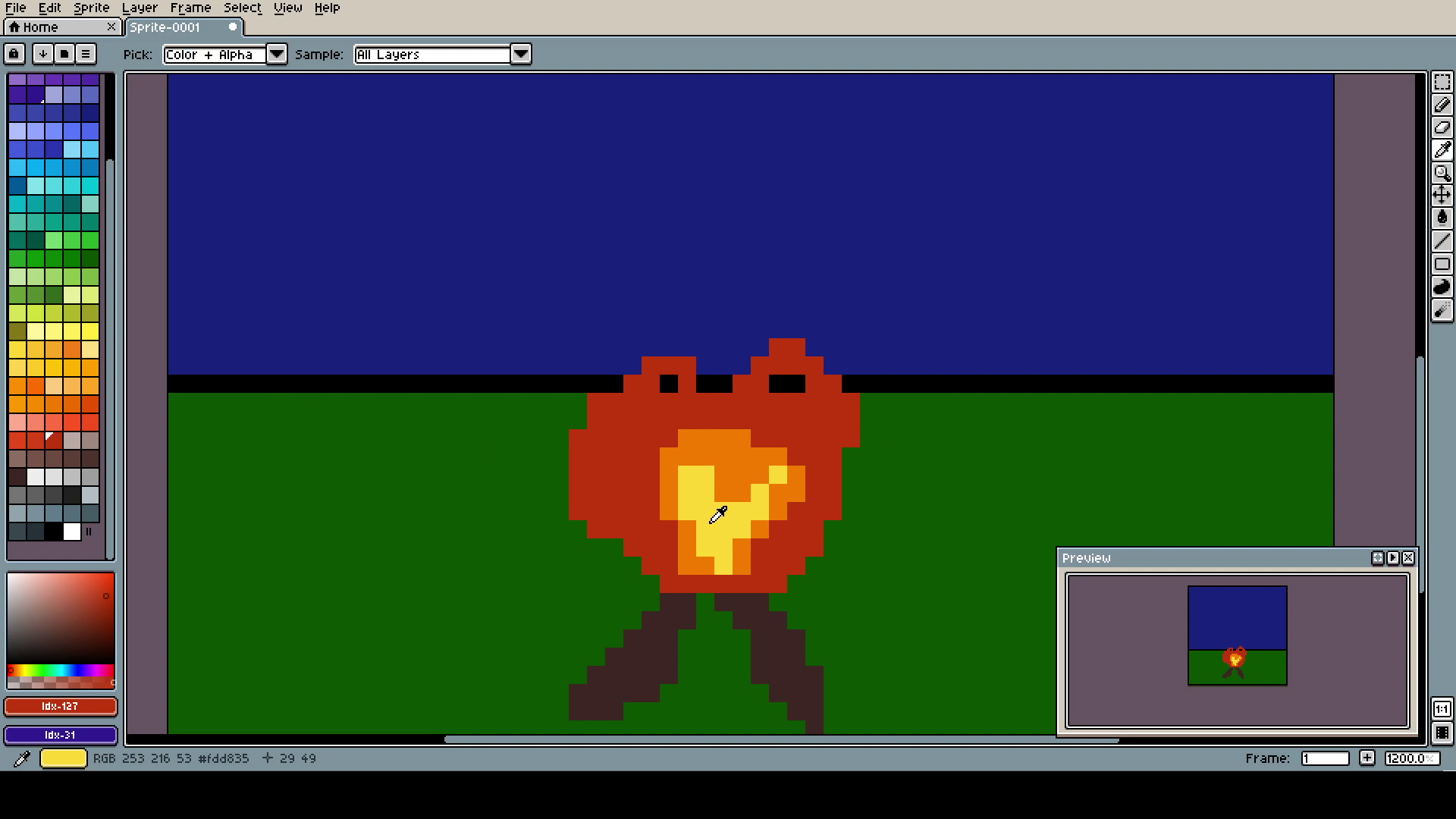
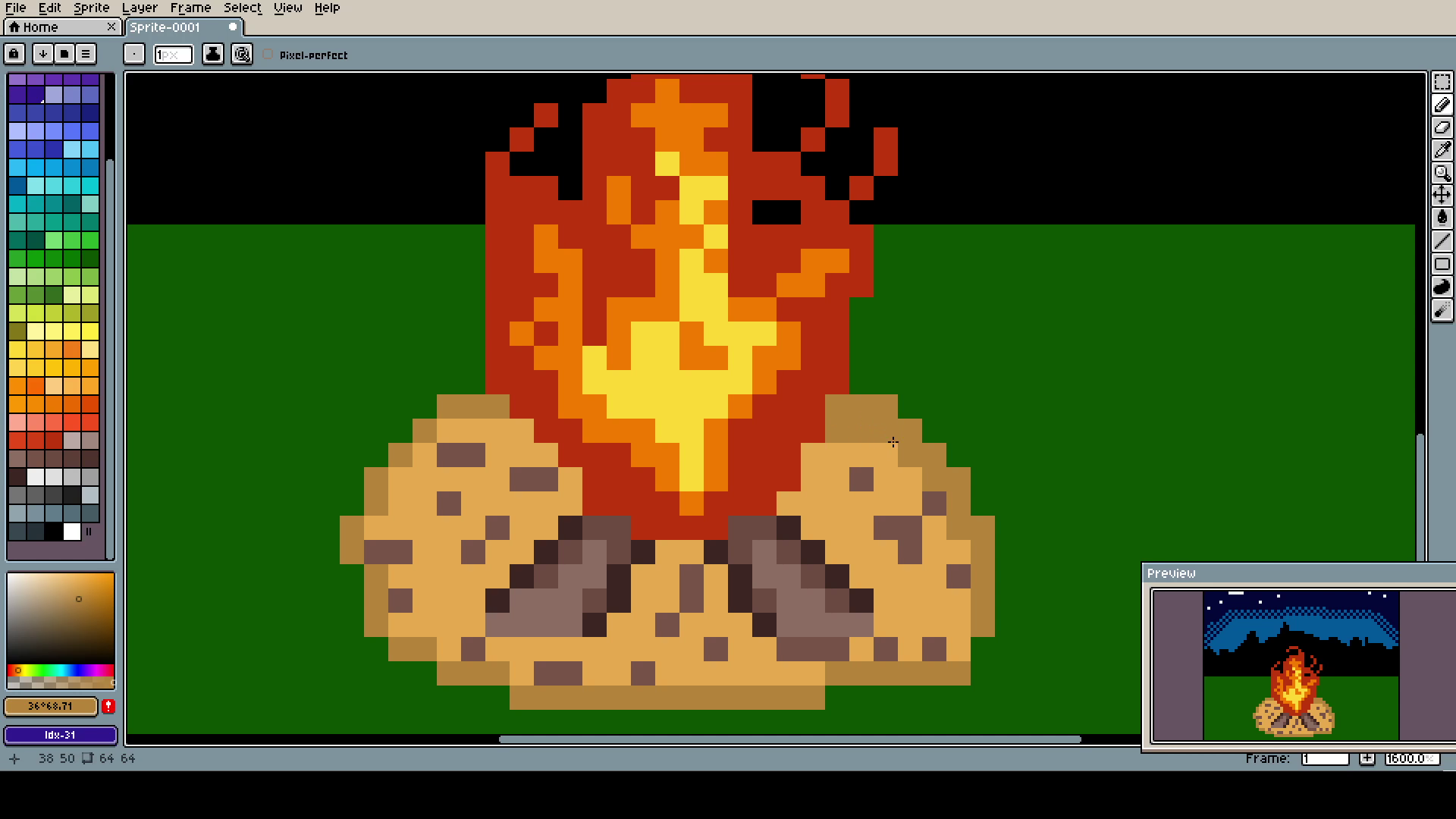
Fire is so interesting to draw. It's really hard to catch its ethereal nature, it looks like solid and liquid at the same time. I want to try portraying it more often, if I master it, I can add it to literary anything to make it look cool.
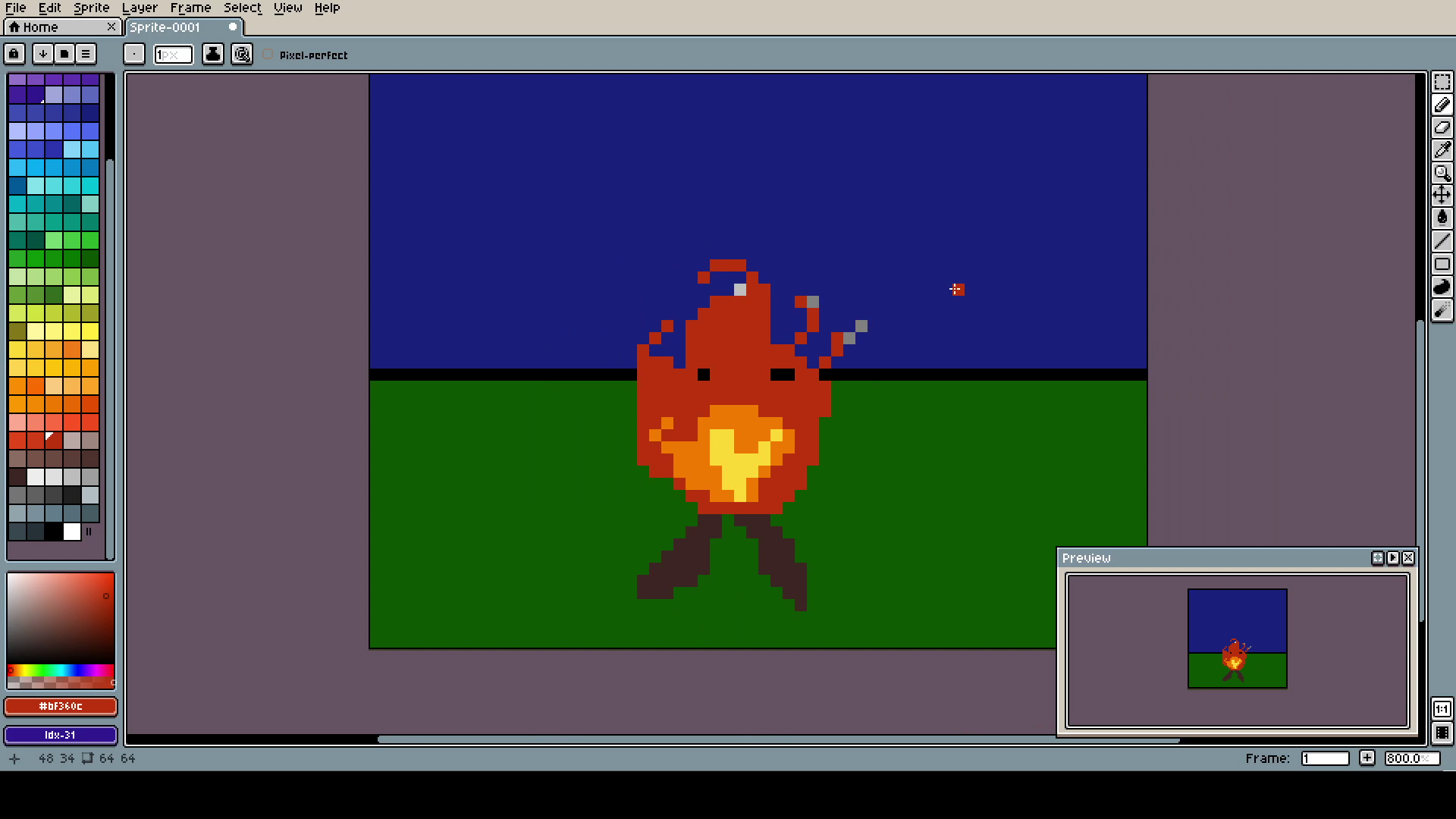
Still not quite it, but the single pixels at the top are the most important. Because of their disconnection to the center, they add fluidity and illusion of movement (or I'm just incredibly sleep-deprived and passing out, and that's why they seem to be moving for me).
The bright, strong center makes sure that you know there is the core of the campfire. Also, it's yellow... I like yellow... so it’s the most important part, and you can not do anything about it!
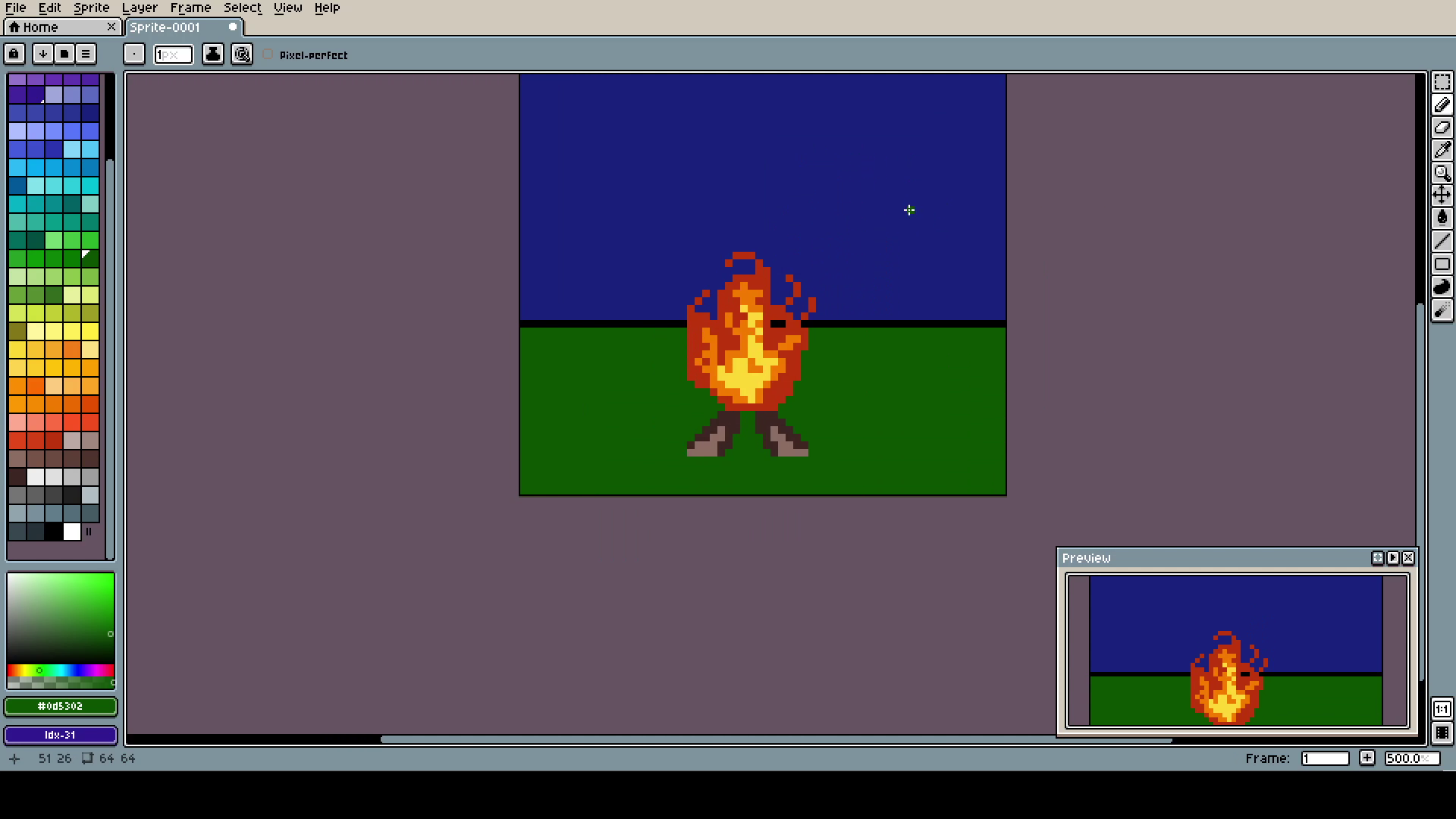
This one is here to show that you should not stress if one part is looking out of place. The contexts adds a lot of clarity.
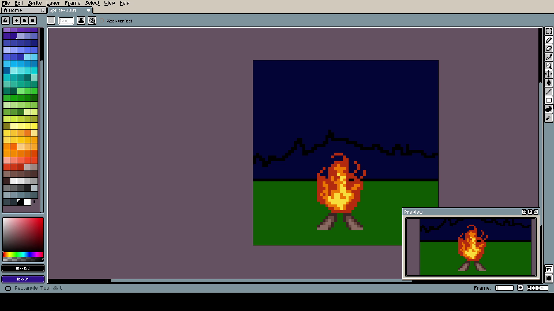
Here I started working on the "dark forest" in the back. As always, first the shape, then filling, lastly the details.
These lines are crucial to determine if your next planned scene takes too much space. Use them as a guide.
The sun raising, as it always will, no matter how dark the night is. Remember that!
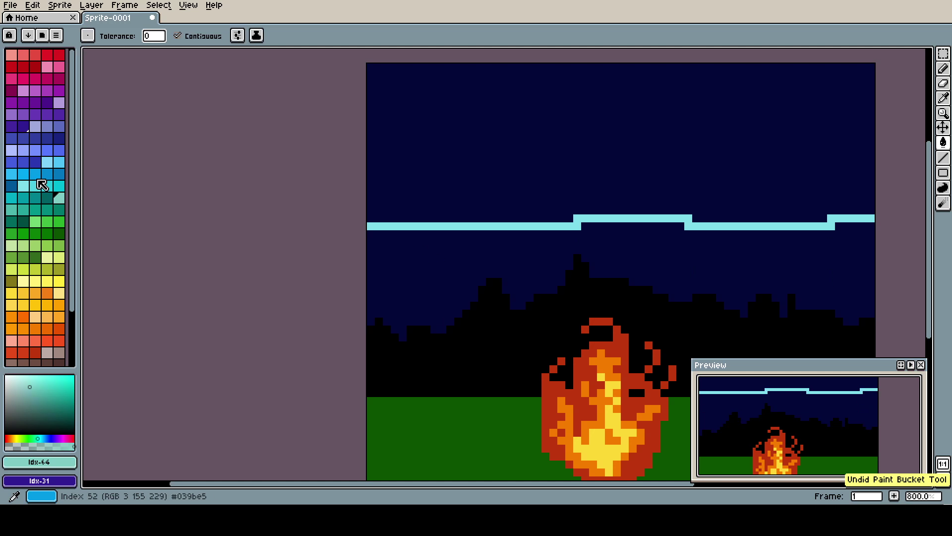
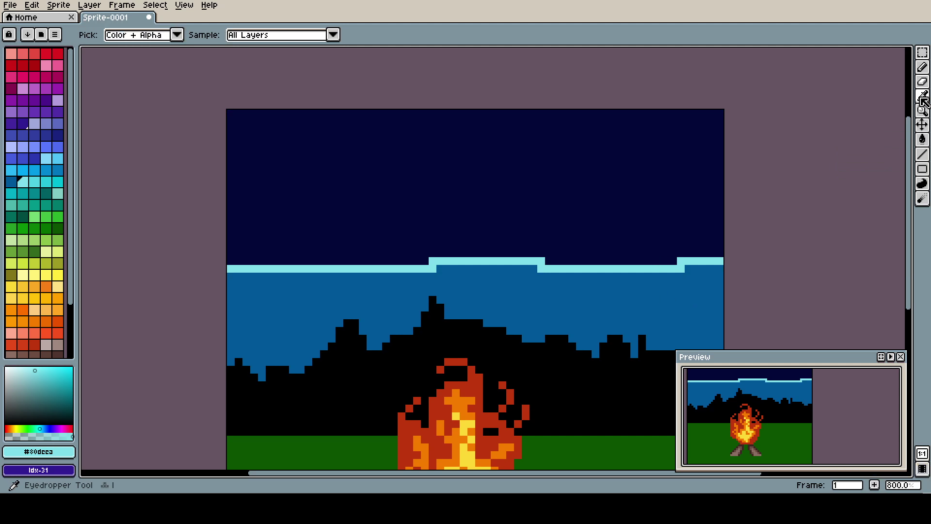
I saw this fascinating way of connecting two colors. Typically, I just put something with a tone in between the two. This one takes more time, but looks unique (it's not finished here, do not scream)
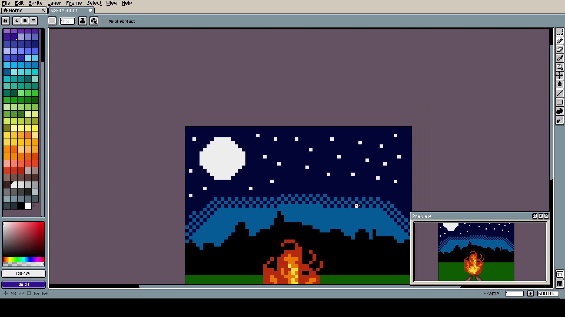
Some moon and stars for the night sky. Just place white dots in random places, not too close to each-other, and it looks cool enough.
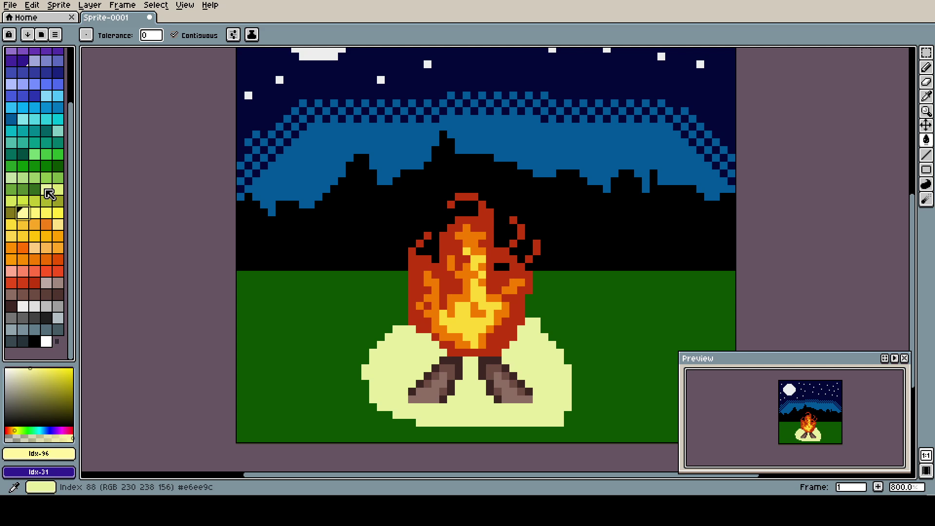
The only space that was flat and ugly was the ground. So I tried (key word) to add some lightning to to imagine.
It's the only way I can draw ground. Just place dark-brown dots on light-brown background. Later I add gray dots too, but it's too advanced for a guide like this one.
Cut the back "dark forest" part a little.
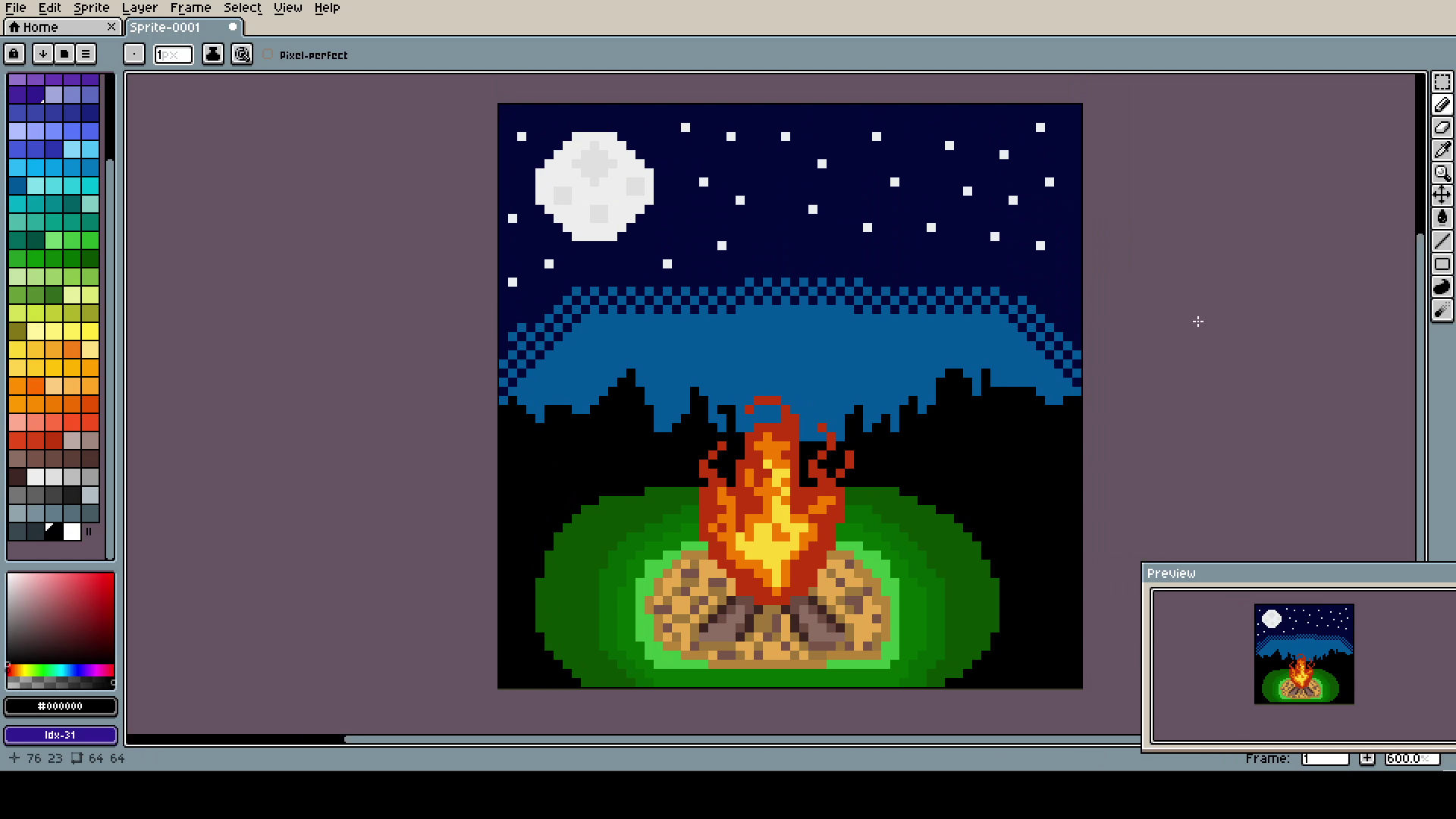
The proportions are not perfect, but the first time they won't ever be. You should also try out more styles and methods of what ever you are doing. Just a little change can make all the difference. It will keep the thing fresh, exciting and challenging!
The time-lapse will be on Twitter, as it always should (if I do not forget hehe)